
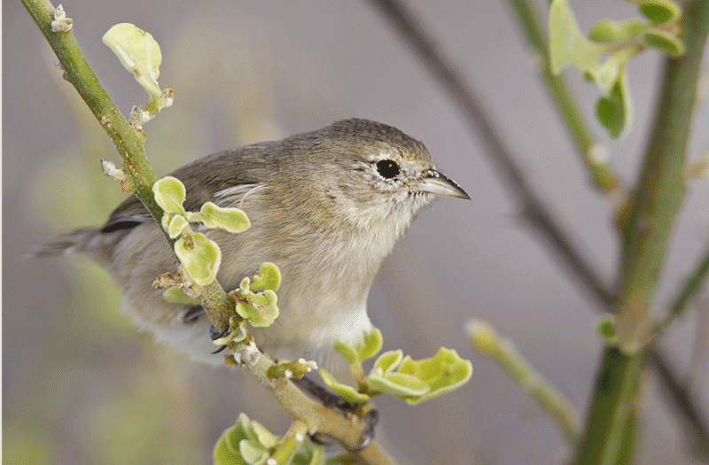
The Warbler Finch image image was created at Gardner Bay, Hood Island, in the Galapagos with the the tripod-mounted Canon 800mm f/5.6L IS lens, the 1.4X III TC, and the EOS-1D Mark IV. ISO 800. Evaluative metering +2/3 stop: 500 sec. at f/8 in Manual mode. Lens/TC/Camera Body Micro-Adjustment: +10. |
What is the Worst Thing About This Image?
It should not be too difficult to tell which is the before image and which is the after. The converted RAW file was too BLUE and a bit too dark. First I adjusted the color and the tonality. For the clean-up I used Divide and Conquer, the Patch Tool, and the Clone Stamp Tool. I removed an o-o-f branch (lower right) that protruded towards us. O-O-F stuff in front of the plane of focus is generally an image wrecker. I also removed a few particles of sand from the plumage and some but not all of the sand from the bill. I wanted to show that the bird had been feeding in a sandy environment without leaving it a mess. All of course–plus tons more of workflow and Photoshop tips–as described in Digital Basics (a pdf that is sent via e-mail).
This is my best-ever image of Warbler Finch, a Darwin’s finch species that has undergone adaptive radiation and wound up with a small, sharp insect-eating bill. I feel that I did a good job with the clean-up without trying to make it too perfect. Here’s the question: what it the biggest problem with this image? What do I not like about it. Be specific.
Shopper’s Guide
Below is a list of the gear used to create the images in this blog post. Thanks a stack to all who have used the Shopper’s Guide links to purchase their gear as a thank you for all the free information that we bring you on the Blog and in the Bulletins. Before you purchase anything be sure to check out the advice in our Shopper’s Guide.
Support both the Bulletins and the Blog by making all your B & H purchases here.
Canon 800mm f/5.L IS lens. Right now this is my all time favorite super-telephoto lens.
Canon 1.4X III TC. This new TC is designed to work best with the new Series II super-telephoto lenses.
Canon EOS-1D Mark IV professional digital camera body. My two Mark IVs are my workhorse digital camera bodies.
And from the BAA On-line Store:
LensCoats. I have a LensCoat on each of my big lenses to protect them from nicks and thus increase their re-sales value. All my big lens LensCoat stuff is in Hardwood Snow pattern.
LegCoat Tripod Leg Covers. I have four tripods active and each has a Hardwood Snow LegCoat on it to help prevent further damage to my tender shoulders 🙂
Gitzo GT3530LS Tripod. This one will last you a lifetime.
Mongoose M3.6 Tripod Head. Right now this is the best tripod head around for use with lenses that weigh less than 9 pounds. For heavier lenses, check out the Wimberley V2 head.
CR-80 Replacement Foot for Canon 800. When using the 800 on a Mongoose as I do, replacing the lens foot with this accessory lets the lens sit like a dog whether pointed up or down and prevents wind-blown spinning of your lens on breezy days by centering the lens directly over the tripod.
Double Bubble Level. You will find one in my camera’s hot shoe whenever I am not using flash.
Be sure to check out our camera body User’s Guides here.
The Lens Align Mark II. I use the Lens Align Mark II pretty much religiously to micro-adjust all of my gear an average of once a month and always before a major trip. Enjoy our free comprehensive tutorial here.
Delkin 32gb e-Film Pro Compact Flash Card. These high capacity cards are fast and dependable. Clicking on the link below will bring you to the Delkin web site. There is lots of great stuff there. If you see a product that we do not carry let us know via e-mail; we will be glad to have it drop-shipped to you and save you a few bucks in the process.

|
I pack my 800 and tons of other gear in my ThinkTank Airport SecurityTM V2.0 rolling bag for all of my air travel and recommend the slightly smaller Airport InternationalTM V2.0 for most folks. These high capacity bags are well constructed and protect my gear when I have to gate check it on short-hops and puddle jumpers. Each will protect your gear just as well. By clicking on either link or the logo below, you will receive a free gift with each order over $50.


My guess is that you would have preferred a little more depth of field. But at least the focus on the eye is bang on. Hmm, for me, and in spite of the fact that I see why you did it, I would leave in the pollen on the face. Removing it intrudes too much into the natural history. But as you say this is your best pic of this species so far, obviously you were pleased to get it. Apparently they’re pretty small, as Darwin thought it was a Wren till he got one back to England.
See my thoughts in the post here.
The dark OOF branch.
Wonderful image Artie, and the clean-up made a huge difference.
I’m gonna take a stab at your question. If it was something easily correctable in post you would have done it, and like me you don’t normally care where DOF falls as long as the face is sharp therefore your techs are up to par, so it has to be something out of your control…say, something like the breast feathers being caught on the leaf? Right or wrong that was my first thought, and surprisingly no one mentioned it yet 🙂
Did not mind that; see what I hated (and a repost) here.
Great to see you stopping by. (Dan is one of the crack Avian moderators on Bird Photographers.Net.) artie
Better luck on your next trip to Galapagos !!
The habitat, as they say, I find very interesting. The transformation from the original shot is quite remarkable. The only dislike I have is the bud and leaf above the bird in the upper left which I find very distracting. Its removal would give the branch more symmetry with the brown leafless branch that compliments the colors of the bird.
2 things I always notice.
1) plane of focus seems a little far forward or maybe not deep enough. The branch to the left is in front of the bird and in focus but the birds legs are out of focus. Then again Artie did say: O-O-F stuff in front of the plane of focus is generally an image wrecker.
2) The blotchy yellow-green background behind the bird. The background is soft gray, this yellow-green area highlights the birds o-o-f tail. If this area were gray the tail would fade away and not be noticed. This is what I’d guess Artie doesn’t like about the image.
You may have a point about the sharpest focus being a bit in front of the bird…. artie
for the bird the flash in the eye?
Hi Scarlet, No flash was used. Didn’t we do a TV show for Canon together way back when? artie
The image has little to commend it and is simply a record shot imo. The background is a disaster – much too busy. If you can remove the bg clutter then this would improve matters but not much. Remember what they say about “silk purses” and “sows ears”?
Hey Jed, Thanks for stopping by. I don’t think that it is as bad as you make it out to be…. But heck, I asked. artie
The question is interesting as are many of the more emphatic comments. I agree with Gregory Sharko as to the subjective nature of such calls, and although removing that one broken stem from the foreground was a real improvement I don’t think the rest of the changes were helpful. I would never have removed the pollen grains from the chin feather – that’s what this little guy does for a living.
Sand not pollen 🙂 artie
I agree with Elinor, the angle of view is just very unnatural. Makes the bird look way too short.
The angle of the body, as a whole, distorts the shape of the bird. I agree with others that the darker diagonal branch should go.
The only thing I dislike is the loss of the bird’s back half to focus and angle. What a geat capture!
Second vote…head angle
The out of focus foot.
In removing the blue cast, some of tonal contrast on the feathers was lost, especially around the eye. I might have selectively increased the mid tones on the bird to bring back that contrast. I’d have kept a few grains of sand below the bill to emphasize the bird’s activity. That would also draw the eye to the sharpest part of the image, the bill.
On the right, I’d remove all branches except the main part of the green one, keeping its leaves. However, I’d tone down its prominence, maybe with a blur or desaturation. That branch frames the bird nicely.
The very dark diagonal branch as described by Alan Lillich, in my mind is the major flaw, and can be easily remedied. As the eye invariably goes to the area of greatest contrast, this becomes a distracting element, that does not contribute specifically to the image.
Head angle!
Rear half of the Finch is completely out of focus…ugly contrast with in focus front half.
“Ugly” might be a bit harsh…. artie
The branch the Warbler Finch is perched on cuts the bird in two.
Artie…color and contrast are very subjective and not worth talking about BUT that pale yellow leaf in the upper left has got to go
I find all of the twigs/branches in front of the bird kind of ugly. Also, I’m not crazy about the yellowish tint of the remaining leaves on the branch the bird is perched on; the branch/leaf color is better in the original.
Loren
The tail. The angle of view makes the back of the bird in a strange posture making the tail too short and not fitting the bird.
These learning (I’m trying anyway) blogs are great! Thanks
His/her head angle is such that it doesn’t engage the viewer. I wish he were facing just a bit to the right toward me rather than straight-ahead profile.
PS … I agree with Alan’s comment too.
The yellow flower above his seems distracting.
I would like to have a little less space above the bird and more below. This comment may be a little nit picking.
I think the flaw is the dark OOF BG branch from top center to lower right. All of the other prominent vegetation is green, so this one sticks out. Being a similar color to the bird it sucks the eye off the bird. It kind of acts like a wall also blocking where the bird is looking, giving a cramped feel.