
| [Not a valid template] |
|
This Brown Pelican image was created at La Jolla, CA on the recently concluded San Diego IPT with the Canon 800mm f/5.6L IS lens and the EOS-1D Mark IV. ISO 400. Evaluative metering +1/3 stop: 1/800 sec. at f/9. It is likely that this is a sub-adult bird as the red bill pouch is indicative of a bird in breeding plumage but the rest of the bird is reminiscent of a one year old bird. |
Two Simple But Great Tim Grey Photoshop Tips
When I created the image above, I had not cleaned my sensor in a while. When I processed the image, I noted three serious dust spots. I usually eliminate dust spots with the Patch Tool (“P” for me but not the default) but this time hit “J” for the Spot Healing Brush. Digital Basics folks will be familiar with the fact that I use lots of keyboard shortcuts (including many that I create myself such as “P” for the Patch Tool). In any case, I have been disappointed in the Spot Healing Brush ever since I switched to CS-5. When I have used it, I have always gotten smudging, even with something as simple as a dust spot. I had correctly set Content Aware on the Option bar but was still getting horrible smudging.
| [Not a valid template] |
|
Here you can see the dust spots that were giving my Spot Healing Brush problems. For about seven years I have been using a Lens Pen to clean my sensors quickly, easily, and safely. Purchase a Lens Pen Combo Kit from us and we will e-mail you detailed sensor cleaning instructions. Learn more here. Once the Delkin Sensor Scope came along things got even easier. If you have never cleaned your sensor and are scared stiff of doing so my best advice would be for you to save $10 by purchasing the Sensor Cleaning Bundle w/Scope, receive and study our instructions, and get to work. Thanks to Robert O’Toole for teaching me to use a Lens Pen to clean the sensors of my digital camera bodies. |
Whenever Tim Grey co-leads an IPT with me I make sure to have a list of Photoshop stuff that has been bugging me. (I am trying to sign him up for Bosque next year….) At the first opportunity, I asked him about the problems that I had been having with the Spot Healing Brush. He responded instantly, “What do you have the hardness set to?” “Zero,” I replied. “I teach folks to set the hardness of all brushes to 0%. ” “Wrong!” he said. “The Spot Healing Brush with Content Aware set works best at 100% hardness.” I tried it and it worked perfectly, not only for dust spots but in a variety of others situations as well.
“Furthermore,” he continued, “you complain that when you use the Clone Stamp Tool that you get color but no texture. What do you have the hardness set at?” “Zero again,” I said confidently. “Wrong again,” Tim shot back. Yikes, I thought, I have been teaching folks to set their brushes to 0% hardness for years. “50% works great for the Clone Stamp Tool,” said Mr. Grey. Not wanting to give in completely I set the hardness for my Clone Stamp Tool to 40% and have been thrilled with the improvement.
Live and learn. Thanks Tim!
|
Two coots were fighting. I swung the big lens around to frame them and they disappeared for about 30 seconds. I was mystified. When they surfaced, peace reigned and one of the birds leaned back to flap. I created three images and kept two. I used the Canon 800mm f/5.6L IS lens with the EOS-1D Mark IV. ISO 400. Evaluative metering -1/3 stop (to save the white bill): 1/2500 sec. at f/6.3. I used the 2 AF sensors below the central sensor; I love that for much of my duck photography. |
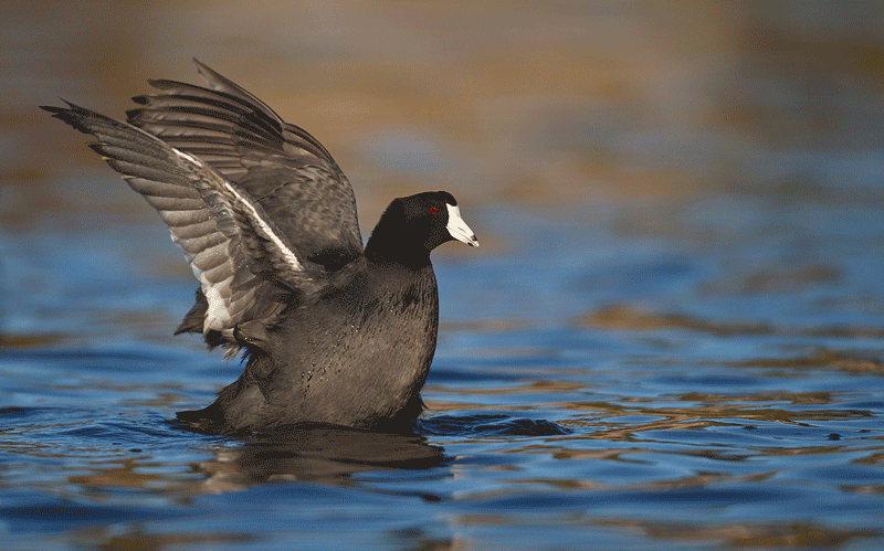
Which coot image do you like better, the wide image or the tight image? If you leave a comment let us know why you prefer the one that you do.
Shopper’s Guide
Below is a list of the gear that I used to create the image above. Thanks a stack to all who have used the Shopper’s Guide links to purchase their gear as a thank you for all the free information that we bring you on the Blog and in the Bulletins.
Canon 800mm f/5.L IS lens Right now this is my all time favorite super-telephoto lens.
Canon EOS-1D Mark IV professional digital camera bod.y And this is the very best professional digital camera body that I have even used..
And from the BAA On-line Store:
Gitzo 3530 LS Tripod This one will last you a lifetime.
Mongoose M3.6 Tripod Head Right now this is the best tripod head around for use with lenses that weigh less than 9 pounds. For heavier lenses, check out the Wimberley V2 head.
Double Bubble Level You will find one in my camera’s hot shoe whenever I am not using flash.
Delkin 32gb e-Film Pro Compact Flash Card Fast and depen.
If you are considering the purchase of a major piece of photographic gear be it a new camera, a long lens, a tripod or a head, or some accessories be sure to check out our complete Shopper’s Guide.


Phil, YAW. When it comes to Photoshop and Photoshop instruction, Tim Grey is the bomb.
Thanks for making more people aware of Tim’s work. He is the best teacher of Photoshop that I have come across and I imagine I have come across pretty much all of them.
The wide shot is charming. The bird appears poised at the decisive moment as though it has not yet decided whether to take off or merely flap its wings. I like the ambiguity. The parallel wings are attractive, the front (right) wing is attractively flared at the tip. Together they form a strong diagonal which points nicely to the head where the catchlight draws attention to the eye. My eye travels around the image following a more or less triangular path from the bright white beak to the eye, down to the slightly upturned tail, a charming feature which points up to the wings, and then the wings point back to the eye–great movement around the image. Another feature of the bird, the flat head, is echoed in the slightly flattened appearance of the chest in this shot, which I find interesting. And I like the extra bit of light emphasizing the bird’s face and the extra negative space, which frames the bird. The upturned tail echoing the upturned wing tip really make this image for me.
On the other hand, the sense of forward motion in the tight image is fun, too. The tension of the water drawn upward as the bird lifts up is a wonderful feature. The slightly outstretched neck gives the bird an earnest appearance, which is appealing. In this image, the curved wing is echoed in the very slightly curved breast, but the wing line is broken by a bump which steals attention from the bird’s eye. The gap between the wing and the head is a bit distracting and also competes somewhat with the eye. In general, the movement around this image is not as smooth as it is in the other image, and it has more distracting elements.
Two nice images, but I prefer the wide shot.
The wider shot may seem more pleasing to me for a reason we haven’t discussed. It has some adherence to the rule of thirds, on a horizontal basis. I know, that rule doesn’t have to apply in every image – but if you look at the distances above and below the bird (never mind the actual wingtips), there is some feeling of the rule of thirds. I also like that the wider image is a tad bit lighter and the gold tones are in the upper third of the image, more or less.
Now, if you had captured the other 99% of the action, imagine how nit-picking we’d get.
I really do like both images very much.
Keith, Thanks for the explanation.
Joerg, Been there, done that. My brain is beyond frazzled. Yesterday I brewed a pot of coffee onto the counter–forgot to put the pot in place…. The days before I forgot to add the water. This morning I got it all right. I am so proud of myself 🙂
“Since I got about the same value as you did is there a reason that the factory would set them with a slightly better focus to the front?”
The factory didn’t “set” them to front focus, Robert.
All cameras and lenses come out of the factory set to within a pre-defined tolerance of a reference “perfect” focus adjustment.
Let’s say for the sake of argument that “within tolerance” for any given unit is ten either side of perfect.
If your lens is at +5 and your camera body is at -5, the two – in effect – cancel each other out and you’ve got a perfectly sharp combo: but if both camera and lens are at -5 (both individually well within factory tolerance, you’ll note) then the combined result is the need for a +10 adjustment to get back to zero.
Ouch. Sorry about that. Have been busy… JR
Joerg, Your brain is as frazzled as mine. That was not the blog; it was on BPN 🙂 Here.
Stephen, Follow the link above and you can stare at the two images for as long as you care to 🙂
I’d most prefer to have the two side-by-side or above and below; with the two images frantically swapping back and forth, I couldn’t give them careful consideration.
I prefer the wide one, for the greater spread of color, and because I find the curve of the back wing in the close shot awkward-looking.
Arthur, not sure what happened. There existed a previous version of the blog post earlier today/late yesterday to which I and others replied. The previous version had two separate images of the coot and in addition the gif image. The tips by Tim Grey were not published in that version. Maybe you/someone accidentally published a draft version…
Anyway, still like the wider version (the 2nd in the original post) better. JR
The wider: better balance in the picture, catchlight and more aesthetic shape of the bird.
I definitely like the closeness of the tighter one!
Robert, It is just coincidence. Joerg. Please provide a link to the coot post you are referring to. Thanks. And yes, there is a huge difference, that’s why I called it a great tip 🙂
I like the wider image with a bit more space around the coot. I also like the way the wing feathers look more than in the closer image.
What happened to the comments to the previous blog post with the two coots? Anyway, thanks for passing along your learning re the spot healing brush. Tried it and it indeed makes a TON of difference. JR
I prefer the tighter … it seems more dynamic and immediate to me. I do agree with Becky about the second conveying more forward motion; that being said it seems a bit more static to me, possibly because it is more in the center of the frame. I do like the wing position in the wider shot … it looks like he is flying a flag behind him.
[…] This post was mentioned on Twitter by Photo Babble, Alltop Photography and PHotography, Orlando Photography. Orlando Photography said: Two Simple But Great Tim Grey Photoshop Tips & Which Coot Image is Better and Why? http://bit.ly/esj2xw […]
While I like the location of the bird in the frame of the wide shot, I prefer the the tight shot because of the nice curve of the back wing.
Since there is still plenty of detail in the wider image I like it better. BTW I got your Alignment tools a few days ago and aligned my 400 mm DO lens and found as you did with your 400 DO that it needed about 10-11 + adjustment. Since I got about the same value as you did is there a reason that the factory would set them with a slightly better focus to the front?
To be honest, they’re both nice 🙂 It would be nitpicking to choose one over the other–though I like the wing extension better in the wider shot. Personally though, I like the pelican shot better. You can’t beat a bird with red parts for a nice photo. By the way, for those of you in Florida photographing birds, you’ll take heart in knowing that no matter how good your photos are or aren’t, we have SIX FEET of snow on the ground in Connecticut 🙂
jeff
I like the tight image slightly better (for reasons cited above) but wish it had the catchlight in the wide image. Thanks so much for passing along these great PS Spot Healing tips from Tim Grey. I’ve been using the wrong hardness all along!
Maybe this is a good test for a psychologist – to separate the plopers from the gliders. :o) I’d rather glide at speed than plop. Becky (aka Adrenaline Junkie)
Okay – I like the less tight one better. I realize at first blush the wings may appear better in the tight image, and of course both images are great. But for me the less tight one has the edge – because of the forward impulsion it shows and the catchlight.
I’ll see you before that in Ft. Meyers.
Becky, There is no first or second 🙂 Wide or tight?
Hi John! See you soon in Homer!
I prefer the tight for two reasons. First, the streaming water detail is more present and pleasing. Second, the more upright position reveals both wings for more interesting detail. Both are great.
I prefer the second of the two . . . the one that is sitting down in the water just a bit more. I like his eye better in that one(there’s a catchlight), but mostly, I like the motion conveyed. The first image makes the coot appear to be plopping down into the water, and the second one suggests more forward motion. Reminds me a bit of Pegasus.