
| [Not a valid template] |
|
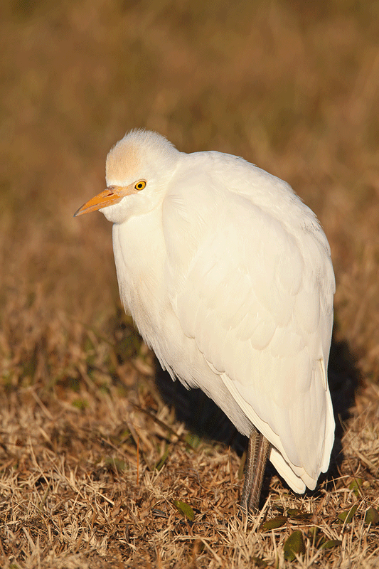
This is the optimized Cattle Egret from the December 15th “What’s Wrong With These Images?” blog post. See my comments on the comments immediately below 🙂 |
Assorted Comments
Wow. Please don’t take this personally–and I do appreciate all the folks who took the time to comment, and I am a lover of what is, but many of the comments smack of the boys and girls taking potshots at Mr. Famous Bird Photographer. I am not saying that this is a contest winning image, but it is a decent and salable photograph. Let’s consider a few snippets.
“Bad head angle.” As the person who coined term with as it applies to bird photography, the head angle here is perfect. I would not change it 1/2 degree in either direction.
“Foreground distracts because it is brighter and seems to be (sic) sharper.” The brilliant white bird is obviously brighter than the brown and yellow grasses. And the sharpest thing in the image is the bird’s eye.
“There is a metal band on the bird’s left leg.” There was no band on either leg. The whitewash on the bird’s left leg was dealt with during image optimization with a series of small Quick Masks.
Regarding “I think I would have …. opened up to F 2.8 or F4 and used an ND filter to cut the light yielding better feather detail overall and defocusing both the background and foreground. Singh-Ray has that neat vari-ND filter. This would be the perfect shot to try it out.” #1: With the 800 and the 1.4X II TC f/8 is wide open so it is not possible to open up to f/2.8 or f/4. #2: The Singh-Rau vari-ND filter comes in a variety of sizes but the 800 lens takes 52mm drop-in filters. The vari-ND is not an option. #3: As the image was perfectly exposed with the histogram well to the right, using an ND filter would not have yielded better feather detail at all.
“poor egret looks like it’s in a shadow box – no room to breathe – claustrofobic…” For images of that include the whole bird, we teach folks (including Danny Deen :)), not to go larger than 75% of either frame dimension. Thus, I am fine with the framing here.
“the lighting angle was too high…” I am not sure what that means but the image was created about 75 minutes after sunrise in rather sweet light.
“Problem with the cattle egret looks to me like obvious flash causing shadows and over exposure causing loss of detail in feathers. Flash is too strong, maybe my computer screen is doing this for me.” Yes. As previously advised, calibrating your monitor would be a good plan. No flash was used on this image. Heck, it was not even mounted. As previously noted, no part of the image was over-exposed. And as you can see in the optimized image, there is loads of detail in the WHITEs.
“too centered…” The bird is well back in the frame with twice as much room in front of the bird as behind….
By popular demand, I did an additional Linear Burn on the WHITEs and added some BLACK to the WHITEs in Selective Color.
Both IPT veteran Monte Brown and Thomas Chamberlin came close to identifying the major problem with the image (as seen through my eyes anyway): the rather tall, out-of-focus piece of grass on the lower frame edge directly below the bill was the biggest problem here. We teach, “Anything out-of-focus between you and the subject will always be a major distraction.” Such is the case here. As Fabrizio figured, that was dealt with during image optimization (with a Quick Mask).
I also eliminated the blade of grass that Monte mentioned, eliminated many of the brighter, whiter blades of grass, and cleaned the bill (using the Clone Stamp and the Patch Tool. As I knew from the start, the optimized image looks pretty darned good.
As for a lower angle, I was using the BLUBB in my vehicle with the window rolled all the way down so I could not get any lower. Had I gotten out of my SUV the flock would have flown the coop. The image could use a teench more room below. As for the bird having “no feet” I am not gonna stop photographing birds standing in the grass….
As for the shadow, I would have preferred that it were not there but moving in either direction would have increased its size. I tried lightening but it looked really yucky.
As for the crane image, it was obviously (“No need to comment on the major problem with this one; I think that it might be fairly evident”) intended to be humorous (though several missed that :)) I posted it to show how frustrating bird photography can be at times as I missed a spectacular opportunity.
It’s a good thing that I do not take things personally.
With regards to “Flames,” the image featured in the December 16th post, I prefer the first image, the softer one with the more muted colors (but only by a small margin). Something in between might be best.
To give you a better idea of what I did with the image clean-up of the Cattle Egret image I created the animated GIF below.
|
|
To learn how I used the Clone Stamp, the Patch Tool, and Quick Masks check out our Digital Basics File.


Bill, Getting low would have resulted in a much more beautiful, intimate image.
Arthur,
You write, “As for a lower angle, I was using the BLUBB in my vehicle with the window rolled all the way down so I could not get any lower.” You’ve explained why the lower viewpoint was unavailable, but not whether you agree or disagree that it would have improved the image. Of course, since life is unfair, a lower viewpoint would likely have obscured even more of the feet.
Bill
Artie,
Optimized image is much improved. The reality is the vast majoirty of images are not show stoppers, it is the constant practice with the camera and the willingness of others to share that may improve our images. As students and fellow photographers, we have to be willing to employ the knowledge you so willingly share.
Merry Christmas
Monte Brown
Thanks for the animated versions. A great way to see the before and after, like looking over your shoulder at your computer.
I will soon. But I’m off to a holiday event . . . . it’s about those 9 (NINE!) grandchildren. How do I clone myself so one of me can do ONLY bird photography? You lucky dog!
Becky
Hi Becky, If you read the post carefully you will see why I am sticking with my potshots line of thinking…. It’s happened before and will happen again and I am loving it.
I am and always have been open to good honest critiques and suggestions. On BPN folks routinely help me to improve my work. But here folks made stuff up and invented stuff just to be negative.
But I did like the number of comments 🙂
Hey, let’s see your Photo Editor picks from the lightbox.
Oops! “Famous” not “big”
Artie, The “after” looks so much better than the “before.” I just think the bird’s pose makes him look rather pathetic. His eyes seem to be cast downward and he looks kind of “slumped.” It’s not a criticism of your photography . . . it’s simply my first impression when looking at the image.
Potshots at Mr. Big Bird Photographer? No, you’ve just taught us to be so critical that we don’t know when to turn it off. Besides, making a few of those corrections did lead to a better image. :o)